
props
1. props
부모 컴포넌트로부터 전달된 속성값, 상속받은 속성값
자식 컴포넌트에서는 props 변경 불가능 -> 변경은 부모 컴포넌트에서
자식 컴포넌트에서는 부모 컴포넌트에서 전달된 props를 함수의 파라미터로 받아서 사용한다.
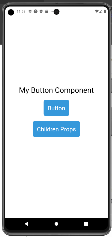
이전 3-2장에서 커스텀 컴포넌트인 MyButton 컴포넌트에 title 속성을 부모 컴포넌트인 App.js에서 props로 전달해 설정해보겠다.
App.js에서 title에 My Button 글자를 전달하고,
MyButton 컴포넌트의 함수에 파라미터로 props를 전달받아 버튼 title을 설정했다.
export default function App() {
  return (
    <View style={styles.container}>
      <Text
        style={{
          fontSize: 30,
          marginBottom: 10,
        }}
      >My Button Component</Text>
      <MyButton title='My Button' />
    </View>
  );
}
import React from 'react'
import { Text, TouchableOpacity } from 'react-native'
const MyButton = props => {
return (
<TouchableOpacity
style={{
backgroundColor: '#3498db',
padding: 16,
margin: 10,
borderRadius: 8,
}}
onPress={() => alert('Click')}
>
<Text style={{ color: 'white', fontSize: 24 }}>{props.title}</Text>
</TouchableOpacity>
)
}
export default MyButton
또한,
컴포넌트 태그 사이에 전달된 값은 자식 컴포넌트의 props에 children으로 전달된다.
props에 children이 있다면 title보다 우선시 되도록 props를 설정해보겠다.
App.js
<MyButton title='Button'>Children Props</MyButton>
MyButton.jsx
<Text style={{ color: 'white', fontSize: 24 }}>{props.children || props.title}</Text>
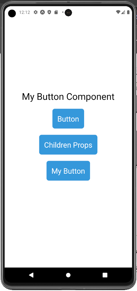
그 결과,
title로 전달된 props 값보다 children 값이 화면에 표시되는 것을 확인할 수 있었다.
1️⃣ defaultProps
: props가 전달되지 않는 경우 사용할 기본값, 빈 값이 나타나는 현상 방지
App.js
<MyButton />
MyButton.jsx 에 정의한 defaultProps
MyButton.defaultProps = {
    title: 'My Button',
};
defaultProps를 설정해 title props가 전달되지 않은 경우 자동으로 빈 값이 아닌
'My Button' title이 나타나는 것을 확인할 수 있다.
2️⃣ propTypes
: 컴포넌트에 props를 전달할 때 잘못된 타입을 전달하거나, 전달하지 않았을때 경고 메시지로 알리는 방법
: 함수, 객체, 배열 등 다양한 타입 지정 가능
propTypes는 prop-types 라이브러리를 추가로 설치해야한다.
npm install prop-types
propTypes를 이용하면 타입과 필수 여부를 지정할 수 있다.
MyButton.jsx
MyButton.propTypes = {
    title: PropTypes.number.isRequired,
};
현재 title에 문자열을 받고 있지만 propTypes를 설정하면서 title 타입을 숫자로 지정했다.
따라서 잘못된 타입의 props를 받는다는 경고 메시지를 확인할 수 있었다.
또한, isRequired로 필수 값으로 정의했기 때문에 props가 전달이 안되면 마찬가지로 아래와 같은 경고 메시지를 확인할 수 있다.
단, defaultProps로 기본값을 설정했기 때문에 현재 컴포넌트에서 경고 메시지는 보이지 않는다.
Warning: Failed prop type: Invalid prop 'title' of type 'string' supplied to 'MyButton', expected 'number'. Warning: Failed prop type: The prop 'name' is marked as required in 'MyButton', but its value is 'undefined'.
타입 문제를 해결하기 위해 propTypes의 title 타입을 string으로 변경하여 에러 메시지를 없애주었다.
state
2. state
props는 부모 컴포넌트에서 받은 값을 변경할 수 없지만, state는 컴포넌트 내부에서 생성되며 값 변경이 가능하다.
상태가 변하면 컴포넌트는 리렌더링 된다.
1️⃣ useState
: 리액트 Hooks 중 컴포넌트에서 상태를 관리할 수 있도록 해주는 Hook
: 상태 관리 변수, 변수를 변경할 수 있는 setter 함수를 배열로 반환
: 상태 변수는 직접 변경하지 않고 setter 함수를 이용해야한다.
: 항상 초기 값을 설정하는 것이 좋다.
예를들어,
count를 설정하는 state를 정의해 useState를 사용해보겠다.
숫자의 상태를 관리할 count 변수와 상태를 변경할 수 있는 setCount 세터 함수를 만들고 초기값은 0으로 해주었다.
커스텀 버튼 컴포넌트를 이용해 +1, -1 버튼을 만들고 count 값을 볼 수 있도록 설정했다.
import React, { useState } from 'react'
import { Text, View } from 'react-native'
import MyButton from './MyButton'

const Counter = () => {
    const [count, setCount] = useState(0);
    return (
        <View style={{ alignItems: 'center' }}>
            <Text style={{ fontSize: 30, margin: 10 }}>{count}</Text>
            <MyButton title="+1" onPress={() => setCount(count + 1)} />
            <MyButton title="-1" onPress={() => setCount(count - 1)} />
        </View>
    )
}

export default Counter
그 결과,
버튼을 통해 +!, -1의 상태 변화가 이루어지는 것을 확인할 수 있었다.
또한,
useState를 여러번 사용하는 것도 가능하다.
event
3. event
1️⃣ Press 이벤트
• onPressIn: 터치가 시작될 때 항상 호출
• onPressOut: 터치가해제될 때 항상호출
• onPress: 터치가해제될 때
• onPressOut 이후호출
• onLongPress: 터치가 일정 시간 이상 자속되면 호출
이벤트 테스트를 위해 모든 Press 이벤트를 설정해주겠다.
import React from 'react'
import { Text, TouchableOpacity } from 'react-native'

const EventButton = () => {
    const _onPressIn = () => console.log('Press In\n');
    const _onPressOut = () => console.log('Press Out\n');
    const _onPress = () => console.log('Press\n');
    const _onLongPress = () => console.log('Long Press\n');

    return (
        <TouchableOpacity
            style={{
                backgroundColor: '#f1c40f',
                padding: 16,
                margin: 10,
                borderRadius: 8,
            }}
            onPressIn={_onPressIn}
            onLongPress={_onLongPress}
            onPressOut={_onPressOut}
            onPress={_onPress}
        >
            <Text style={{ color: 'white', fontSize: 24 }}>Press</Text>
        </TouchableOpacity>
    )
}

export default EventButton
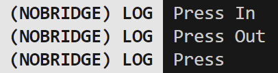
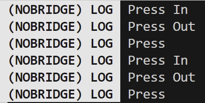
화면에서 버튼을 클릭하면
onPressIn ► onPressOut ► onPress
혹은 onPressIn ► onLongPress ► onPressOut 순으로 호출되는 것을 확인할 수 있다.
+ onPress와 onLongPress는 사용자가 클릭하는 시간에 따라 둘 중 하나만 호출된다.
(delayLongPress를 사용하면 onLongPress가 호출되는 시간을 조절할 수 있다.)
2️⃣ change 이벤트
: 변화를 감지하는 이벤트
: TextInput 컴포넌트에서 주로 사용
: onChange 속성은 TextInput 컴포넌트에 입력된 텍스트가 변경될 떄 호출됨
변화된 text를 출력하기 위해 event.nativeEvent.text를 setText 함수에 전달해
변화된 텍스트를 text 상태 변수에 저장해 변경되는 값을 출력해주었다.
import React, { useState } from 'react'
import { Text, TextInput, View } from 'react-native'

const EventInput = () => {
    const [text, setText] = useState('');
    const _onChange = event => setText(event.nativeEvent.text);

    return (
        <View>
            <Text style={{ margin: 10, fontSize: 30 }}>text: {text}</Text>
            <TextInput
                style={{ borderWidth: 1, padding: 10, fontSize: 20 }}
                placeholder='Enter a text...'
                onChange={_onChange}
            />
        </View>
    )
}

export default EventInput
위처럼 onChange 이벤트를 정의해
변화되는 텍스트가 정상적으로 화면에 출력하는 것을 확인할 수 있었다.
변화된 텍스트만 필요한 경우
onChangeText를 사용해 간편하게 사용할 수 있다.
컴포넌트의 텍스트가 변경되었을 때 변경된 텍스트의 문자열만 인수로 전달해 호출된다.
3️⃣ Pressable 컴포넌트
: TouchableOpacity 컴포넌트를 대체하는 컴포넌트
: 사용자의 터치에 상호작용하는 컴포넌트
: 기존 다른 컴포넌트와 다른점 - HitRect, PressRect
- HitRect는 실제 버튼 모양보다 약간 떨어진 부분까지 이벤트가 발생할 수 있도록 조절하기 편하게 해줌
- PressRect는 얼마나 버튼에서 멀어져야 누른 상태를 벗어났다는 판단을 조절하기 편하게 해줌
이를 테스트하기 위해서 새로운 프로젝트를 생성한 후 실습을 진행했다.
import { StatusBar } from 'expo-status-bar';
import { StyleSheet, Text, View, Pressable } from 'react-native';

const Button = (props) => {
  return (
    <Pressable
      style={{ padding: 10, backgroundColor: '#1abc9c' }}
      onPressIn={() => console.log('Press In')}
      onPressOut={() => console.log('Press Out')}
      onPress={() => console.log('Press')}
      onLongPress={() => console.log('Long Press')}
      delayLongPress={3000}
      pressRetentionOffset={{ bottom: 50, left: 50, right: 50, top: 50 }}
      hitSlop={50}
    >
      <Text style={{ padding: 10, fontSize: 30 }}>{props.title}</Text>
    </Pressable>
  )
}

export default function App() {
  return (
    <View style={{
      flex: 1,
      justifyContent: 'center',
      backgroundColor: '#fff',
      alignItems: 'center',
    }}>
      <Button title='Pressable' />
    </View>
  );
}
HitRect를 설정함으로써 버튼에서 조금 떨어져 있어도 클릭 되며,
버튼을 누른 상태에서 이동했을 때 항상 같은 위치에서 onPressOut 호출 됨을 확인했다.
또한,
PressRect의 범위는 HitRect 범위의 끝부터 시작하므로 hitSlop 값에 따라 범위가 달라진다.
'공부 > ReactNative' 카테고리의 다른 글
| [ReactNative] To-Do-List 애플리케이션 | 처음 배우는 리액트네이티브 5장 (0) | 2025.01.22 |
|---|---|
| [ReactNative] 스타일 | 처음 배우는 리액트네이티브 4장 (0) | 2025.01.21 |
| [ReactNative] 컴포넌트 | 처음 배우는 리액트네이티브 3-2장 (0) | 2025.01.15 |
| [ReactNative] JSX | 처음 배우는 리액트네이티브 3-1장 (0) | 2025.01.15 |
| [ReactNative] 리액트 네이티브 build하기 (0) | 2024.04.11 |